When it comes to googling ‘great web design’ or ‘web designs for sales’ there are articles by the hundreds. Mostly because marketers and brand owners alike recognize the need for an impressive website and the potential impact it can have on your sales cycle.
Get the infographic!
Whether that’s trying to get a new customer to download your latest e-book in the first 10 seconds of visiting via a colorful pop-up or ensuring your checkout process is just as dynamic on mobile as it is on a tablet or desktop, websites are created to serve the main purpose of giving an interested audience what they want, when they want it and how they want it. Keeping this philosophy in mind, we sat with a few of our in-house design experts to discuss what are the most fundamental practices brands should advocate for when looking to create a new online user experience or improve their site’s current responsiveness.
Responsive layouts matter.
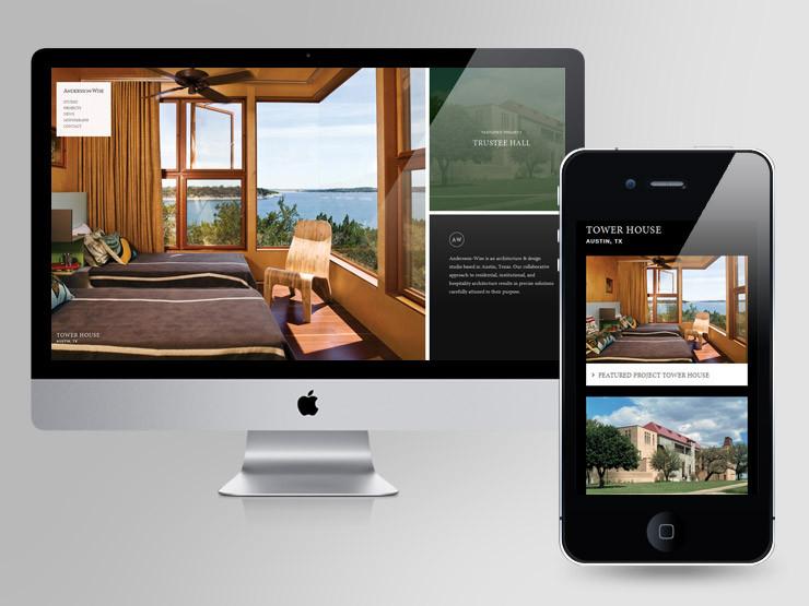
The average page visit lasts less than a minute which makes the general layout, look and feel of your site of utmost importance. Most designers start out with a non-responsive layout, especially when trying to find the right balance of organization for all the parts of the website the client has asked for. When this is complete the real work starts. Designers need to ensure when media queries are added, the layout can come to life in a fast, secure and impressive way, to achieve the user experience the client has in mind for their end-user. What is a media query you ask? Media queries are a CSS3 module that allows the content you’ve created to adapt to various screen resolutions and sizes. In other words, media queries allow your website to look good on every kind of display and with user purchase journeys being everything but linear, web experience quality assurance, across devices, is a must.

Source: https://www.awwwards.com/
Images & videos need to be adaptive
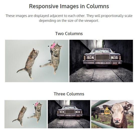
87% of online marketers use video marketing with more than 500 million hours of video watched every day on Youtube. Video marketing has made its stamp on every marketer’s roadmap and ensuring videos and images are responsive to your online storefront, is definitely a critical component of any successful user experience. Platforms like Youtube and Vimeo have recognized this is a pain point for marketing teams without an on-hand developer so they’ve made the Html code for website embedding easily available via the ‘share’ option on each video’s functionality. Be sure to modify the embed code and add the right CSS adjustments for your site’s layout and desired functionality. This will ensure videos render in a user-friendly format and complement the text that supports the intended impact of the visual storytelling incorporated on your website’s layout.

Source: https://www.webfx.com/
Mobile is where it’s at.
In 2016, mobile usage surpassed desktop usage and anyone paying attention to how users use their phone to guide their research and general purchase intent needs, wouldn’t find this such a surprise. Today, the vast majority of Americans, 96% to be exact now own a cellphone of some kind. Furthermore, according to Pew Research, roughly one-in-five American adults are “smartphone-only” internet users – meaning they own a smartphone, but do not have traditional home broadband service. That translates to a huge chunk of the population that spends the majority of their time on their phones, even while in their homes where other devices and distractions are available.
For an effective online shopping or even educative experience (as your site may not be an eCommerce one), the site’s layout, functionality, and general user impression should be optimized for mobile-first since approx. 1.6 billion people use their phones to shop globally. In making your site more responsive mobile-wise, be sure to make information easy to find for target audiences, minimize the usage of Flash as it slows down page speeds and be sure to include the viewport meta tag as this helps with quality assurance of the user’s experience on mobile. Magic Leap, the startup that has created a headset to take AR viewing to the next level designed a site that even on a 3G connection, would load in 7 seconds. Understanding who your customers are is an integral part of the responsiveness question because if they are avid users of their mobile phones for interacting with your brand, responsiveness should be a top priority.

Source: https://www.invisionapp.com/
User experiences are becoming more dynamic when it comes to multimedia.
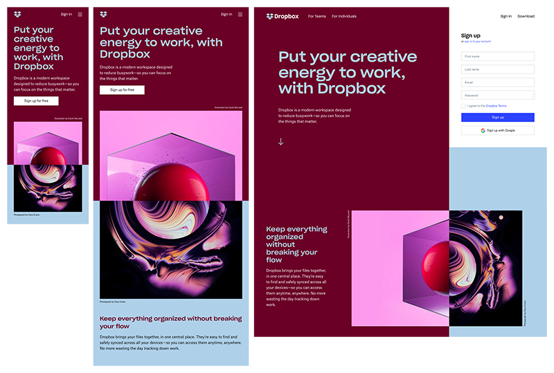
Smashingmagazine.com has defined responsive web design as “the approach that suggests that design and development should respond to the user’s behavior and environment based on screen size, platform, and orientation. In today’s tech scape, you can use Google Lens of Samsung’s Bixby to point to an object and ask the voice assistant to tell you what it is to using AR/VR devices to view how potentially new furniture would look in your living room. That being said, when you’re building a website where you want to pull out all the stops, be sure to make sure you ask questions like “Should this functionality change if this was accessed via a touchscreen interface or a cursor led response?” or “If we add an AR element to the homepage, does this affect users who are not looking to explore that feature on the site?” Regardless of the types of multimedia, you’re using, the user doesn’t care about the work going into the backend, they just want seamless functionality that gets them what they need, in the shortest time possible. Dropbox has done a great job at this where they offered a tailored experience across each device. From the color of the text to the size of the images, the user experience was built to optimize against a multi-device user journey.

Source: https://www.invisionapp.com/
Typography is not what it used to be.
Fluid layouts are a common topic of discussion for front-end developers but the concept of fluid typography is more new school when it comes to web design. When working with creative designers, it’s common to get Sketch or Photoshop layout options for each breakpoint but that limits you the font sizes the designer has suggested when it comes to looking at mock options for the final user experience. Using tools like viewport units, they add a great layer of flexibility that they allow your text to resize in tandem with the functionality of your layouts. Remember, while it is debatable whether responsive text is a true concern when building a responsive website, it does advocate for a simpler user experience across devices where the user feels there is no break in the impression they of the brand in question, regardless of engaging with them on their app, mobile website or desktop site. This type of function supports the attraction and retention of key target audiences and keeping their attention locked in on your content you’re serving them because the user experience is favorable to their needs. Like the example below, fully fluid and responsive design allows the user full control on how they want the text to render on the device they’re engaged on.
When you book a growth consultation with us, one of the first things we look at is how responsive all your marketing products are. Whether that’s a standalone website or multiple websites, apps and more, it’s a key part of the discovery discussion so that we can provide qualitative feedback on how you can improve your site’s responsiveness to ensure you’re proving the most seamless experience to your prospective customers.
Let's Get to Work.
Have an unsolvable problem or audacious idea?
