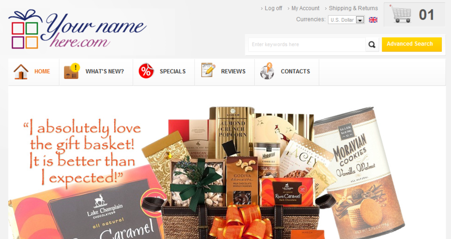
Gift baskets have made so many strides in recent years to be a classic gift with modern appeal. It stands to reason, then, that having a modern website is on the savviest of gift basket businesses’ bucket lists. While you may already have an idea of what makes a basket beautiful and the best ways to appeal to your customers, it can be hard to know where to start with designing the best basket website for customer engagement and conversions. These 5 tips can help wrap your products up with panache, and are time-tested ways to increase your sales.
Engage your customers early by offering a discount or a deal.
Starting the interaction by offering something special adds value to the customer experience and incentivizes shopping. Bonus points if you attach it to an email form, to help facilitate future savings and continued communication with your customer. They already like what you sell (or they wouldn’t have landed on your site) so giving guests an opportunity to stay informed of your products and possible savings can lead to continued purchases from long-term customers.
Feature your best products first
By listing your most attractive baskets first (with pictures above the fold) you’re already helping someone browsing find what they’re looking for. Good design comes from making your customers experience as easy as possible, so why not point them in the right direction with your most appealing and time-appropriate products available right where they start looking.
Use high resolution product photos
This goes hand in hand with the last tip. Humans are visual creatures, so it’s a no-brainer to show them how beautiful or delicious your baskets are as part of the sell. If you integrate high quality photos of your basket from multiple angles, it can really show the quality of your product.
This goes hand in hand with the last tip. Humans are visual creatures, so it’s a no-brainer to show them how beautiful o
In today’s digital age, attention spans are short. Make sure every product description is engaging, dynamic, and SEO rich. Large panes of text are intensive, and studies show that the majority of users only skim content. Use text to tell your customers that your baskets are bountiful, not boring.
Offer multiple price points to add value to features
When looking for ways to increase sales on featured gift baskets, help customers make the best decision by showing the value of each price point. By adding clear descriptors, and indicating what makes the deluxe option the best bang for their buck, you can upsell a standard purchase and increase customer satisfaction.
These tips were developed specifically for gift basket businesses because Dotlogics has extensive experience in this industry. We proudly completed the redesign for https://www.broadwaybasketeers.com/.
-
Contact Dotlogics to start planning your website redesign today.
Let's Get to Work.
Have an unsolvable problem or audacious idea?
