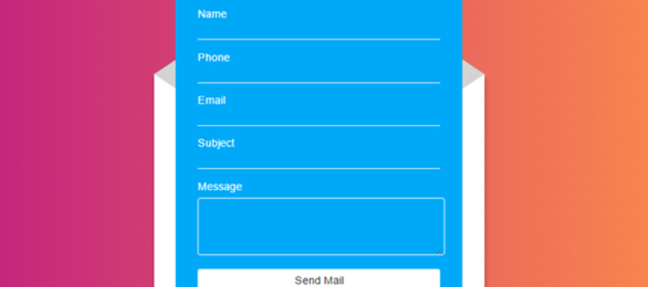
You’ve planned every detail of your website, from site navigation to SEO. The user experience has been tried, tested, and moves visitors from page to page with ease. You’ve reviewed your analytics and everything seems to be going smoothly, minus one thing- you aren’t getting conversions.
Not many people know this, but having an easy to use form on your website can make a big difference. If visitors find you, view your content, respond to your call-to-action, and then fail to fill out the contact form, you’ve lost them. Sometimes for good. This is a major missed opportunity, and more common than you might think. That’s why, we’re excited to share the best way to make the perfect form for your website.
Keep it Simple
This is the number one problem with most forms. Keep the number of form short, the descriptions clear and concise, and limit the number of fields to what you actually need. Also, consider integrating an autofill or save option so returning customers only have to fill out the form once. Ever thought about what makes Amazon so popular? Their one click ordering option makes shopping easy for their customers. You should be making shopping easy for your customers, too.
Make Form Easy to Read
You wouldn’t use illegible font or hard to read colors on the rest of your website; so why would you do it on a form? Use easy to read font, and high contrast colors (like black on white) to help visitors view and understand your form. Avoid crowded drop down menus with so many options it makes it challenging to find the right selection. Also, studies show that aligning text to the top left of each field is optimal for clarity. Just think, if your users can’t read your form, they can’t complete it.
Explain the “What” and “Why”
By using a direct, easy to understand title, you're helping your user understand what the form is. By explaining the need for your form in an informative description, and showcasing what’s in it for the user to fill out the form, you’re helping your user understand why they should complete the form. The perfect form needs both.
Most of these tips can also be applied as best practices for your next website project. If you keep these in mind, you’ll be able to make the perfect form in no time. Can you say “hello, conversions!”
-
Speak to a web specialist at Dotlogics today to start capturing leads through your online forms.
Let's Get to Work.
Have an unsolvable problem or audacious idea?
