If you’ve been following our blog for awhile, you’ve probably noticed a few themes pop up fairly regularly. Among them are the facts that content is king, and that web design is hugely important to
your success.
If you’ve picked up on these trends, then it probably won’t surprise you to learn that these themes are not only important in and of themselves, but they are also important together. By that we mean simply that web design plays a big role role in content marketing.
Yes content can be absolutely critical as part of your marketing strategy, but good content won’t do you much good if nobody can find it. Poor web design can make it difficult for users to see your content, or even make the content itself unappealing, so make sure your content and your design strategies are in alignment.
What is Content Marketing?
For the uninitiated, content marketing is the practice of creating useful content for visitors that generates an interest in a company or its products without necessarily advertising them directly. Examples of this can include running a blog, creating videos, and putting together how-to guides for areas of interest related to your core business.
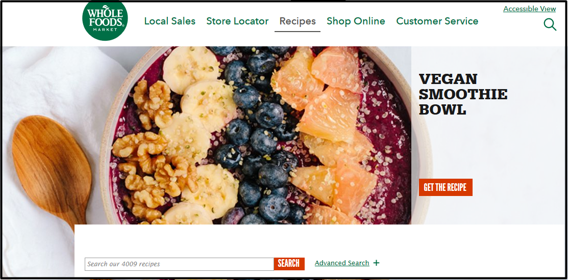
A great example of this is the recipes page on Whole Foods’ website.
Whole Foods Market is primarily a grocery store, not a subscription cooking service, recipe blog, or anything else that might make having a recipes page linked front and center on its navigation bar an obvious decision. As a grocer, however, Whole Foods understands that most of its customer will be cooking with its products, and that makes these recipes brilliant content aimed squarely at its
core buyer groups.
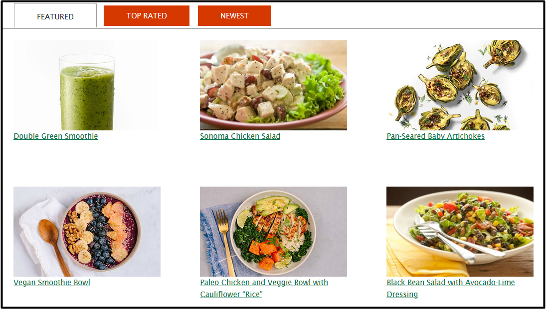
The section is so robust that it necessitates its own search bar and navigation structure. All of those recipes are available for free, which means Whole Foods doesn’t profit directly from any of them. However, with thousands of recipes to browse through, you can bet plenty of users are coming to this website looking for that content specifically, and leaving with Whole Foods on their minds when it’s time to pick up the ingredients they need.
Now that is effective content marketing – valuable content related to the business’ core focus is given away freely, and as a result potential customers make a connection with the business and leave each piece of content with a reason to make a purchase.
What’s Web Design Got To Do With It?
Everything. Having a well designed website can impact how long people stay on it, whether they find what they’re looking for, and whether they even realize your content exists in the first place. There are several main factors at play here.
Visibility
With over 4,000 recipes published to date, that recipe section is clearly an important part of Whole Food’s marketing strategy. That’s why the company put a link to it right in the middle of their navigation bar, making it accessible in a single click from just about anywhere else on the site.
If you want visitors to read your content, then make it visible. Place it squarely in their line of sight, and don’t make them go digging to find it. A nav bar or homepage link will go much further in catching your users’ attention than a tiny link in your footer.
Looks Matter
Consciously or subconsciously, users will make snap judgements about the quality of a company and its materials based on the quality of its website. If your design is sloppy, disjointed, and unappealing, users could get the impression that your company is run equally haphazardly.
Having a website that looks bad will devalue your content, regardless of how good the actual content itself may be. You don’t have to break the mold, but your site should at least be appealing
and consistent.Reading & Comprehension
It’s not just what you say, it’s how you say it. Whether you’re writing a blog, recipe, or any other form of content, chances are you aren’t writing a novel, and your readers aren’t looking for one. Keep your paragraphs short, and add subject headings where appropriate.

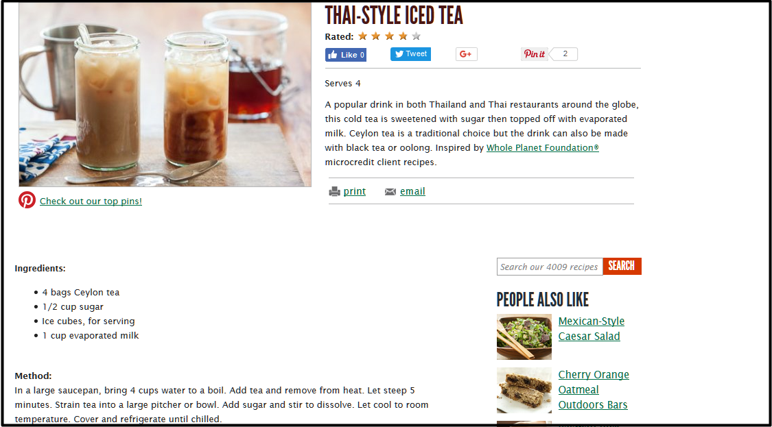
Whole Food’s recipes incorporate pictures, headers, and bulleted lists to make their content easy to read, and alert users to what they can expect from each piece of the content. In one quick glance, the reader can easily discern what items are needed for the recipe, where he or she needs to look for directions, and what the finished dish is supposed to look like.
All of Whole Food’s recipes are designed like this, offering consistency throughout the entire section and making their content more digestible through visual queues and aids. This design would be great if they were trying to sell cookbooks, and certainly does well to build their reputation as a wholesome,
quality grocer.Now look back at the blog you just read and you should notice some of the points we just covered. There are clear subject headers to let you know what you’re about to read, short and concise paragraphs for easier readability, and pictures to illustrate our points visually. If you scroll all the way back to the top, you’ll even see a link to our blog section right in our navigation bar, so you know our content is easy to find. Follow these design principles, and you content will truly shine!
-
Need help creating content or designing your website? Dotlogics can do it all! Contact us today to get started.
Let's Get to Work.
Have an unsolvable problem or audacious idea?
