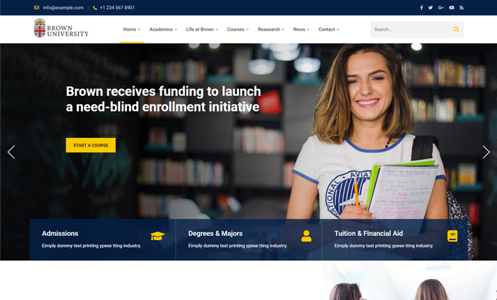
Step Up to the Digital Age A Data-Driven Digital Home

CHALLENGE
Brown University needed an accessible website that shared the mission of its innovative Annenberg Institute and highlighted its impact on children’s education. To best connect with its range of stakeholders, the Institute wanted to showcase its work and make its data available in a way that’s easy to understand.
SOLUTION
Dotlogics designed and developed a robust website that allowed the Annenberg Institute to describe its initiatives and better connect with its target audience. The new website was on-brand and able to fully communicate the breadth of the Institute’s findings, philosophy, and history.
RESULTS
Annenberg Institute now has a cohesive web presence that includes up-to-date listings of events and opportunities at the Institute, as well as an easily navigable depository of its publications.
We offer a customized approach for each of our clients. In this case, the Annenberg Institute for School Reform at Brown University needed an academic website that could be easily navigated and understood by all of its stakeholders. The client’s priorities included making its data and publications available to local educators and policymakers. We partnered with them to develop a strategy for both its web design and digital content that would help achieve its goals.
Services
Design Strategy User Flows Web Design Market Analysis Consultation Content Approach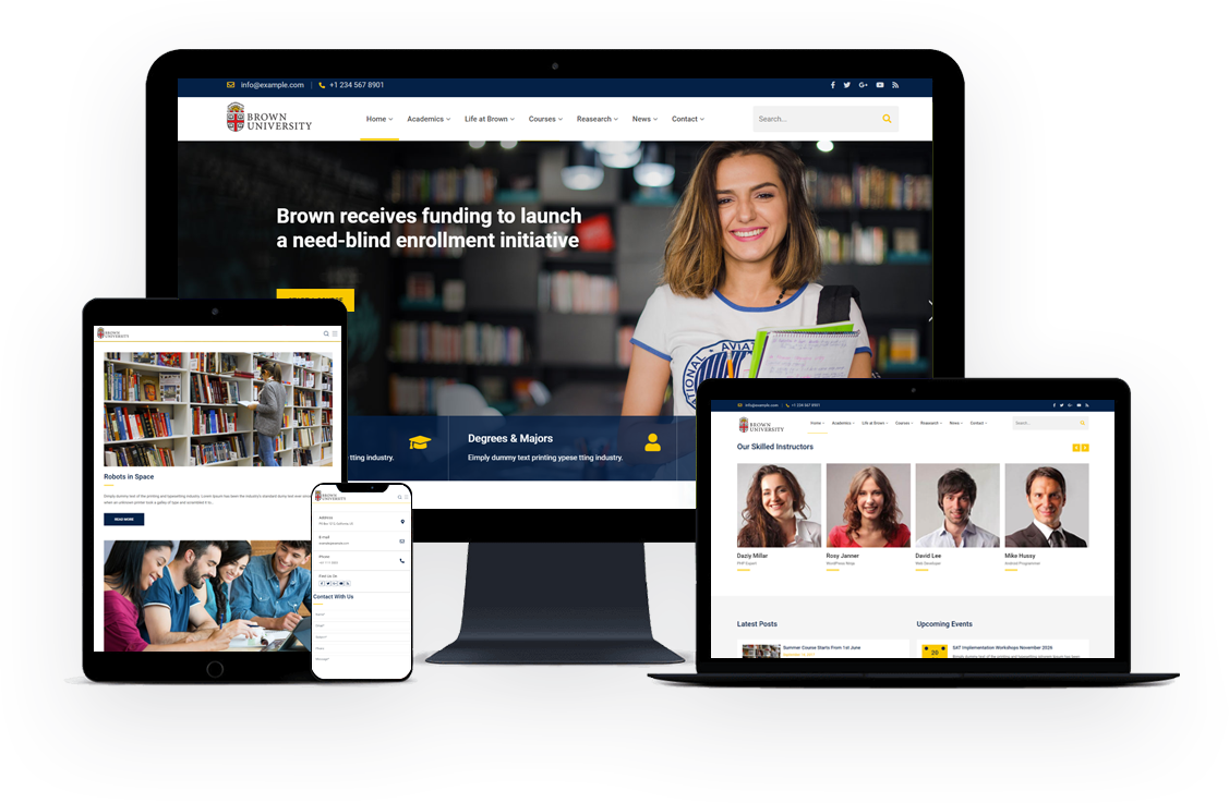
A Classic Color Palette
Brown University has an established color palette that we worked within. Because the Annenberg Institute empowers children’s education, we wanted to add a youthful energy to the existing palette by adding a deep blue.
#002045
#ffc941
#000000
Aa
Lorem Ipsum
Morbi condimentum, ipsum eu vestibulum suscipit, sem lorem suscipit ligula, at iaculis magna metus at mauris. Sed pretium metus turpis, ut finibus.
A Classy Typeface
We chose an unfussy serif for headings and titles. PT Serif offers an academic, professional feel without seeming stiff or overly formal. This font pairs well with the open, friendly Helvetica Neue.


A Fully Responsive Platform
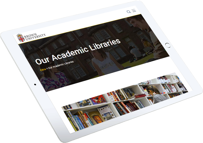
The Annenberg Institute had dozens of whitepapers, data, and other resources that they wanted people to be able to access. Dotlogics worked with the Institute to develop an interactive graphic for visitors to view the data in a way that was easy to understand. This entailed the creation of a flexible, responsive platform through which the Institute could disseminate its findings.

What We Provided
Accessibility Responsiveness Flexibility IntegrityLet's Get to Work.
Have an unsolvable problem or audacious idea?

