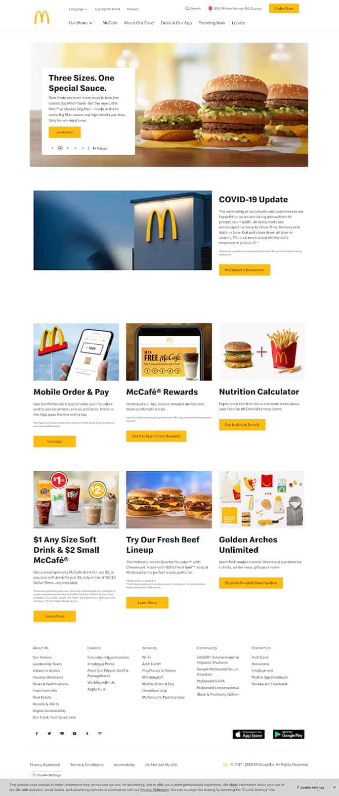
Step Up to the Digital Age An Innovative Marketing Strategy

CHALLENGE
As a well-known fast food company, McDonald’s has a prominent brand and well-established worldwide reputation. Their fame and success means that they need to constantly stay fresh in their marketing approach.
SOLUTION
Dotlogics helps McDonald’s avoid brand fatigue by providing a compelling content strategy that builds on their previous successes. This includes seasonal campaigns, tweaks to the brand, and a well-strategized digital presence.
RESULTS
For each seasonal campaign, Dotlogics provides McDonald’s with a robust cross-platform strategy that’s on-brand and able to effectively connect customers around the world. Visitors can get excited about current specials, as well as learn about McDonald’s latest initiatives.
We believe in affirming our clients’ previous successes while helping them improve. In this case, McDonald’s needs to continually innovate their marketing approach to stay relevant in an oversaturated market. To achieve that, they require dynamic marketers and a responsive website to help them reach their widespread audience. We partner with them to develop a flexible design and content strategy in an international context.
Services
Consultation Design Strategy Campaign Strategy Data Analysis Market Analysis Content Approach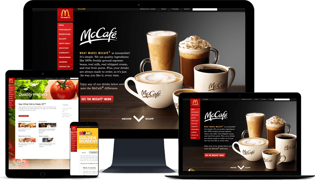
A Fun Palette
McDonald’s golden arches are well known for their vibrant color. We found the perfect web-friendly color to match, then paired it with a lively red that evokes the packaging for McDonald’s famous fries
#FFBC0E
#DB0006
Aa
Lorem Ipsum
Morbi condimentum, ipsum eu vestibulum suscipit, sem lorem suscipit ligula, at iaculis magna metus at mauris. Sed pretium metus turpis, ut finibus.
A Fresh Font
To match McDonald’s sense of fun and new emphasis on fresh food, we chose the appropriately named sans-serif typeface Speedee. Paired with a streamlined, image-driven approach, Speedee gives a friendly look to the website.


Fully Responsive Platform
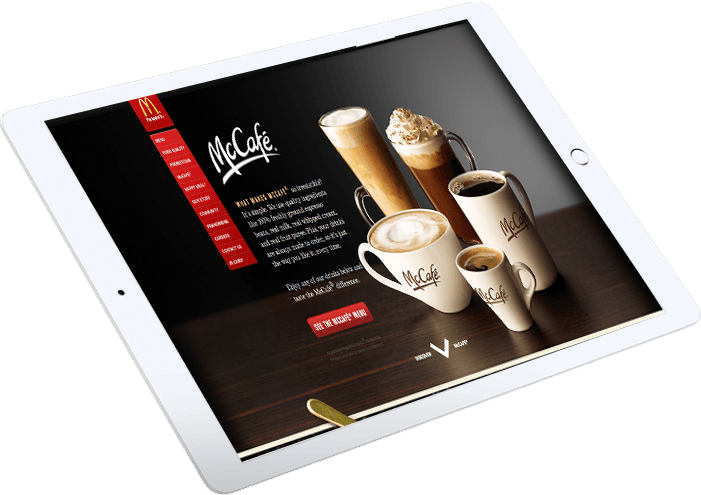
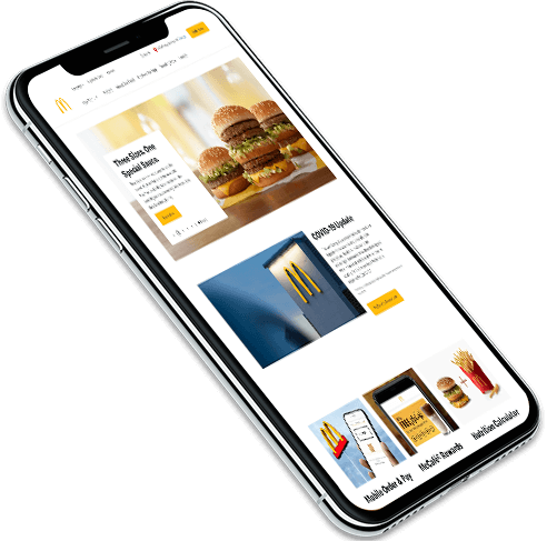
The McDonald’s website must be accessible from around the nation — and beyond. Many consumers visit the site from their phones, which means that Dotlogics needed to ensure that the site featured a responsive design. Dotlogics also incorporated links to external apps to provide a seamless experience for customers.
What We Provided
Integration Accessibility Fluidity ResponsivenessLet's Get to Work.
Have an unsolvable problem or audacious idea?

